JointDJ.com: Collaborative Music Tech

You might remember Txty Jukebox, our free to use collaborative music web app that we built on top of the YouTube Data API. We were happy to find that our original version was well received and even got some press from the folks over at makeuseof.com. Well, we’ve finally got a chance to spend some time ( big thanks to our new hire Josh who led the charge ) to make improvements based on the feedback we received and re-branded it under jointdj.com!

The main idea behind our music inspired web application is to create an easy way for groups of people to collaboratively share and listen to song (and video) requests. Any user with a smart phone or computer can enter the event code provided by the event’s host on jointdj.com and start submitting songs to the event’s playlist. The “event” doesn’t always have to be a traditional party either, for example, we’ve been using Joint DJ ourselves in our office as a Pandora or Spotify replacement.

To see how it works I suggest skimming the jointdj.com landing page which does a good job of quickly outlining how to use. Instead of regurgitating that information here I’ll highlight a few new features/improvements to get excited about:
  • One big lesson learned from our first go around with Txty Jukebox was that while it’s great when everyone at your event is engaged and the song queue is filled up you can run into awkward silences if the playlist runs of songs when people get distracted, say, doing work or playing an intense game of flip cup. In the past you had to wait until someone queued another song so it became a bit of a chore for the event host. To solve this issue and ensure there will never be a silent moment, we’ve created a new feature that lets the event host to pick a genre of music when they create an event from which a song will be randomly selected and played if a playlist ever runs out. For example, I could create an event with “Top 40 / Pop” as the auto fill genre. If at any point during my event the playlist is empty, all the sudden the latest Chainsmokerz song will magically be queued up!
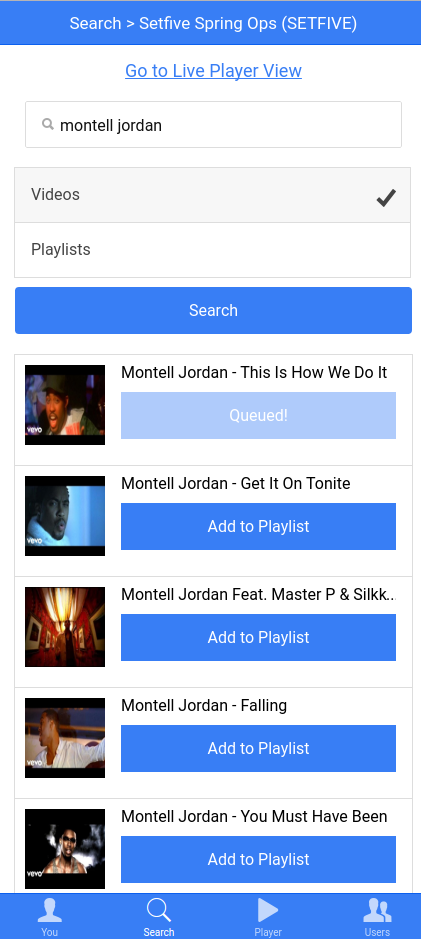
  • Another issue we saw in the first version was that sometimes users didn’t get the exact song played that they were searching for. That was because we automatically selected the first result from Youtube regardless of whether it’s the desired result. For Joint DJ, we’ve added the ability for users to use an intuitive browser based UI to easily search for a song and then review the list of music video results from YouTube along with the thumbnail. Once the user finds exactly what song they want to play they can simply select it to add it to the event’s playlist.

  • Lastly, we improved the design of the live player view where events users can watch and listen to the music videos associated with the requests. You’ll see “flash” messages when songs are added that show the artist, title and which “DJ” submitted it. Additionally we show the next 4-5 upcoming songs in the queue along with their thumbnails on the left side of the player window. Overall, the new look is more colorful and crisp and should be more impressive to the events users keeping them engaged, having fun, and contributing songs to the event. Below is a screenshot of what the live player view looks like:

Fun: The AVC Word Cloud

Happy 2014! In between celebrating Christmas, hanging with family, and ringing in the New Year I managed to put together a visualization of the words used on avc.com. AVC, written by Fred Wilson, is probably one of the most popular “start up” blogs on the Internet. It covers a wide array of topics from “MBA Mondays”, USV portfolio companies and of course general startup and technology news. Given the range of topics and and that the blog has been active since 2003, it naturally seemed like generating a word cloud would produce interesting results. With the goal of generating word clouds in mind, I set off the day after Christmas.

Checkout the finished product at http://symf.setfive.com/d3_avc_blog_cloud/. I actually decided to use Scala to scrape and process the data, look for a follup post on coming to Scala from PHP.

Taking a quick glance at the clouds, a few things do jump out:

  • “Android” enters the top 100 in 2010 and has remained there since.
  • Amazon is surprisingly absent past 2007
  • Apple hasn’t made the top 100 in any year.
  • It’s interesting to see when USV portfolio companies like Disqus and Zemanta enter and exit.
  • Bitcoin makes the list for 2013
  • Blackberry, one and done
  • Facebook peaked in 2007 and then steadily declines until it drops out this year
  • Google hits the list for every year
  • Twitter gets in at 2007 and sticks through this year

Visualizing the Startup Institute Spring ’13 Class

Last week, we got our hands on the class list for the Spring ’13 Startup Institute class. I had some time to burn so I decided to throw together a visualization using the names and email addresses of the members of the class. You can check it out at http://symf.setfive.com/d3_startup_school/

How it works

Basically, the visualization represents every student with a 3×3 color grid by using various attributes of their names and email addresses. The various squares are calculated with the following formulas:

  • Top left: Calculated by taking the first letter of the first name (say C) and then converting it to a % for how far down the alphabet the letter is. So C would come out to 3 / 25 = 12% Then, this percentage value is applied to the “lightness” component of a HSL color tuple for “hsl(40,100%,92%)”
  • Top middle: Calculated by taking the length of the first name and then calculating a % for how long it is compared to the other names in the list. So basically, it finds the length of the longest name and then divides the current student’s name by that value for a %. The % is then used in the lightness component of “hsl(340,100%,73%)”
  • Top right: A color generated using the metaphone of the first name. The metaphone is generated, then split up into 3 pieces, and then the ASCII values of those 3 components are summed. Then, the 3 parts are mapped to HSL values depending on the % maximum they are for the entire sample size.
  • The second row is identical to the first except using the last name.
  • Bottom left: Calculated depending on the “track” that the user is in.
  • Bottom middle and right: These use the same metaphone algorithm except using the email address and email domain name respectively.

Technically, the squares are drawn using the d3 library and the page layout is done with Bootstrap.

Anyway, as always comments and feedback are welcome.

Javascript: Using Bootstrap tooltips with jQuery UI’s slider

Earlier today, I was adding a “slider” UI element to a project that was using Twitter Bootstrap as well as jQuery UI. Although they weren’t designed to work together, the two projects generally stay out of each other’s way since their CSS classes are namespaced pretty well.

Since jQuery UI was already loaded I naturally decided to just use the jQuery UI slider control to power the slider. One of the limitations with the jQuery UI slider is that it has no native way to show the current slider value over the slider handle, as a developer you have to display that number somewhere. Fortunately, the control has the event hooks neccesary to make this happen – specifically the slide event which is triggered everytime the slider is moved.

With Bootstrap also loaded, I decided to try and use the tooltip plugin to dynamically display the current value of the slider above the handle. Getting the initual tooltip setup was pretty straightforward. Check it out here.

But the issue is that even with the “slide” event, the Bootstrap tooltip plugin has no exposed method to force a reposition. The only way to get a tooltip to reposition itself is to hide it and then show it again. Obviously, that’s less than ideal since you get a noticible “jump” as the tooltip is hid and then shown again.

With this issue in mind, I decided to take a look at how the Tooltip plugin actually does the positioning. It turns out it’s really simple, the relevant code is on GitHub. Ok, so its easy to reposition them but how do you get the “right” tooltip div incase you have multiple sliders? Looking through the code, the Tooltip plugin actually uses the jQuery.data() function to store config options and additionally stores a reference to the correct div there. Getting a handle to the correct div is as easy as $(“#slider .ui-slider-handle:first”).data(“tooltip”).$tip

Looking at the actual plugin code, it’s simple enough to just copy that out and use it to reposition the tooltips. Check it out in action at http://jsfiddle.net/cqVPM/7/

Anyway, let me know if you run into any issues in the comments.

D3: Taking a dip

D3 is a “newish” visualization library that has been getting a lot of attention recently. The New York Times has been using it extensively to create visualizations, and in fact its creator is currently employed by the NYT. I’d been meaning to take D3 for a spin for a while but couldn’t find a dataset I wanted to play with until a few weeks ago.

At the end of November, the LA Times published a dataset titled Capital appreciation bonds which highlighted how various California school districts were funding various projects with extremely high interest rate bonds. The LA Times described the data as:

Hun­dreds of Cali­for­nia school and com­munity col­lege dis­tricts have fin­anced con­struc­tion pro­jects with cap­it­al ap­pre­ci­ation bonds that push re­pay­ment far in­to the fu­ture and ul­ti­mately cost many times what the dis­trict bor­rowed. Gov­ern­ment fin­ance ex­perts con­sider bonds im­prudent if the total cost is more than four times the money bor­rowed or the ma­tur­ity peri­od is great­er than 25 years.

Anyway, you can check out my attempt at a visualization here.