Design: How to Make a Vintage Website
Remember what websites looked like before they became so interactive and graphic savvy? The World Wide Web- in the early 2000s- was not aesthetically pleasing. So, we decided to recreate it. Out with the new, in with the old.
Below, we have provided an example of a modern-looking website. Specifically, we used a Bootstrap template. Then, we have listed the changes we made to the current website code. We discovered that the key to making an old-looking website is not using specific technologies, but using the styles and the aesthetics that your site embraces. Let’s take a Bootstrap template, Clean Blog - Bootstrap Blog Theme, and how we retrofitted it!
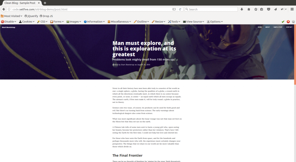
The current, modern version looks like:
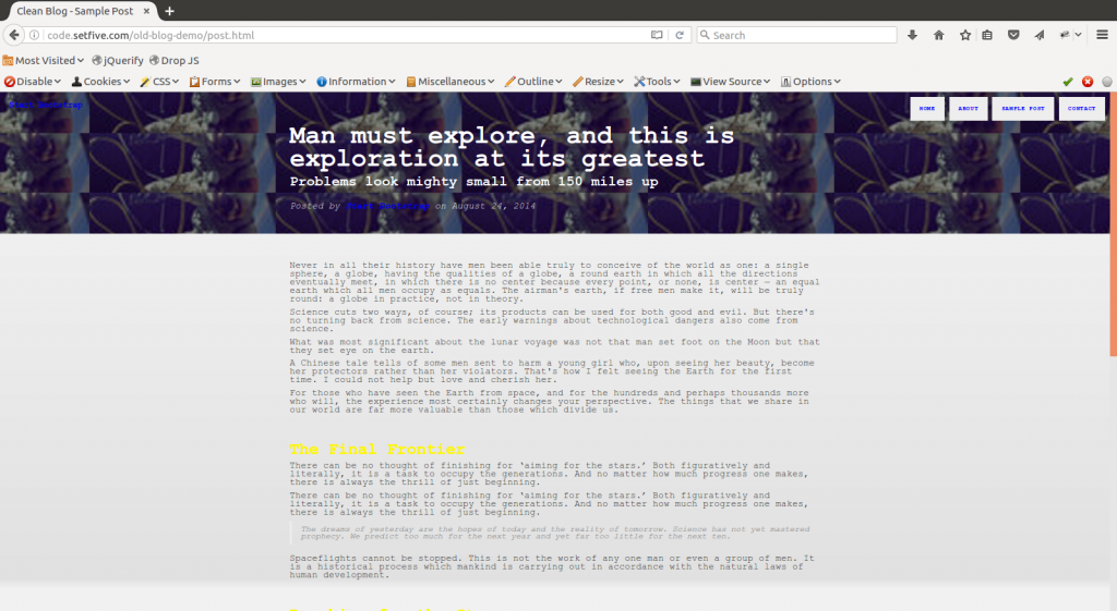
To make it “look old” I made the following changes:
- Removed all of the JavaScript
- Dropped the custom fonts, went back to a fixed width Sans-Serif font (Courier New) and dropped the line-height
- Switched the background image to something low quality and repeating
- Filled all the whitespace by setting the content to 100% width
- Add some obnoxious color - see links and menu items.
- Toss in a gradient for good measure
The final Product:
Some other options for replicating an early 21st century website include: the venerable marquee HTML tag, animated GIFs, and of course, anything neon.
Of course there is always the all time GOAT retro website, the original 1996 Space Jam website, which is still up!
Have additional suggestions for how to make an old-looking website, or any formatting requests you’d like to see? Let us know in the comments below!
Questions or comments about this? Email us at contact@setfive.com.